












From research to redesign
In part one, we explained why we decided to redesign Silverfin, and the research we undertook to understand where we could improve. We looked at how quantitative and qualitative data from hundreds of touchpoints with Silverfin users shaped our understanding of the problem space.
This article picks up from those conclusions and looks at what happened next: how we moved from understanding the problem to exploring possible solutions, testing assumptions, weighing trade-offs, and finding the right path for the redesign.
Our initial focus
While the redesign ultimately impacted the whole of Silverfin, we initially focused on making improvements where it mattered most: the workflows where compliance work is prepared, reviewed, and approved. That’s where we felt we could have the biggest impact.
Our initial discovery surfaced key pain points that any solution would need to address:
- Losing context when moving to and from a core page (like exports or reports) while working in a reconciliation
- Time-consuming back and forth between reconciliations and the workflow working screen
- Finding key pages such as the client file communications inbox or talking points that aren’t visible from a reconciliation
Being clear about the pain points we want to address before we begin ideating solutions helps ensure we don’t just ship new features—we ship real user value.
Designing around real user problems
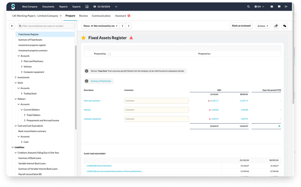
With a clear set of problems to solve, our design team created prototypes to explore possible solutions. These prototypes are lightweight, clickable visualisations that show how ideas could work in practice. They are quick to build and help us learn fast. We used them to visualise dozens of competing ideas and test them with users for rapid feedback.
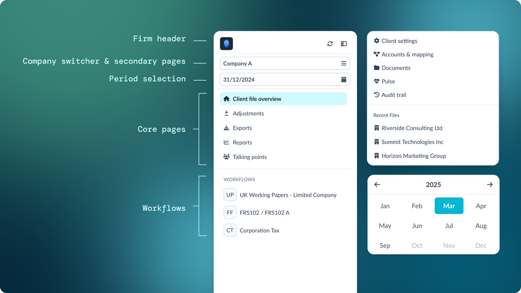
We explored smaller iterations of our existing top menu structure such as surfacing more options, experimenting with new ways to group pages and making workflow navigation more discoverable.
We also explored much bigger rethinks of how Silverfin could be organised, with entirely new structures and layouts. No idea was off the table, and we built hundreds of screens as part of these explorations. Each idea was carefully scrutinised by the design team to assess how well it addressed the pain points we’d identified.
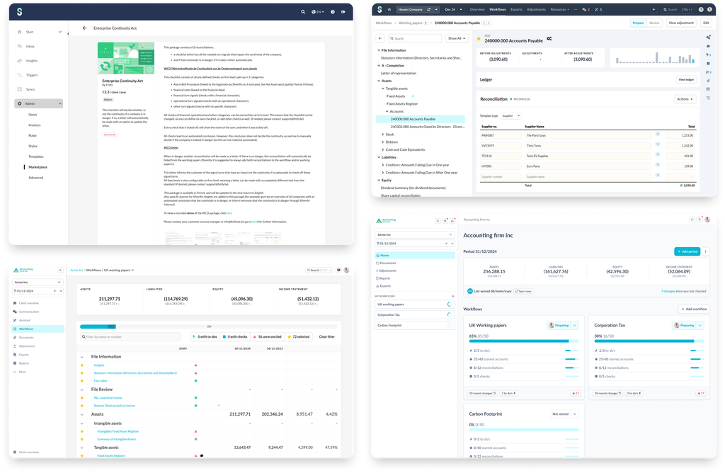
Each direction had trade-offs.
Surfacing more options might improve discoverability, but it could also be overwhelming for new users. Staying close to the existing structure could reduce disruption to experienced users, but it might not create enough improvement.
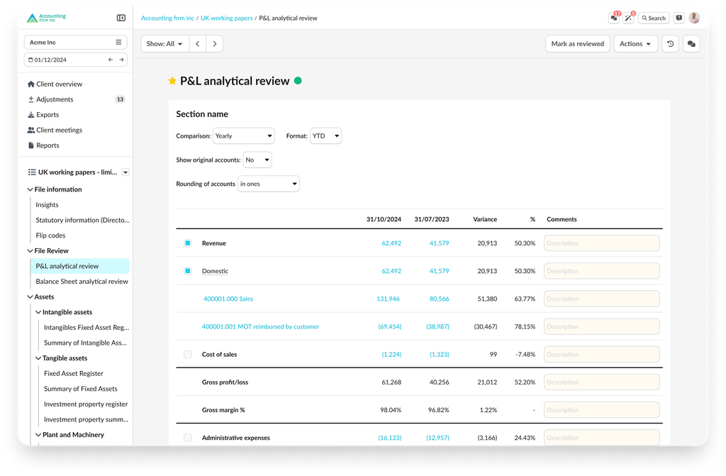
These prototypes helped us identify a balanced path forward; familiar enough that users wouldn’t feel like they were starting from scratch, but different enough to address the problems our research had surfaced.
Accelerated learning through AI powered prototypes
Using the latest advances in AI technology, we built highly realistic prototypes of the leading designs. These AI prototypes generated richer testing insights because they could handle realistic mock data, translations across locales, and responsive resizing to each tester’s device resolution.
We used them to validate key assumptions:
- Could existing users adapt to the new layout without hands-on guidance?
- Could they find core pages like documents, exports, and reports quickly?
- Could they return to a workflow quickly after visiting a core page?
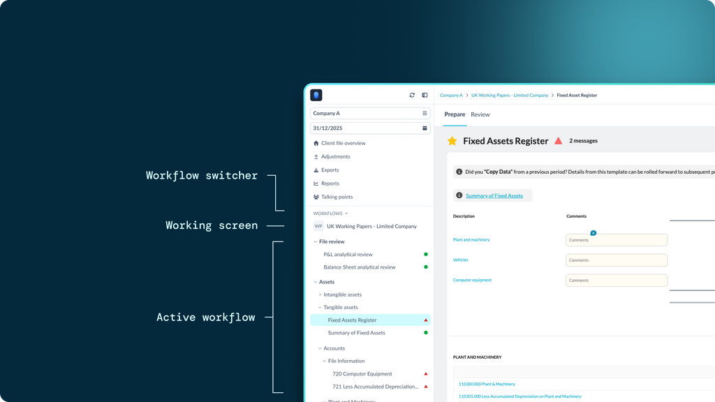
- Would users adopt the workflow navigation tree that was currently performing poorly?
Using these AI-built prototypes, we ran usability tests with our user base. Each test involved a user trying the prototype on their own device and completing a set of tasks, so we could assess whether it met our success criteria.
We did this without providing any demos or guidance on how to use the new layout—an intentional choice. Testers were deliberately thrown in at the deep end and asked to figure out the new layout on their own. It was a true test of how intuitive the design was.
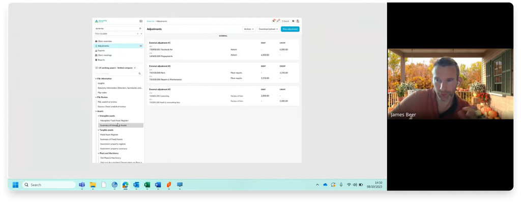
Over the course of this testing phase, we conducted 150+ usability tests in multiple languages across our user base. This gave us rich feedback and clear insights to act on as we refined our designs.
“These tests let us observe users take their first steps in the new layout completely unassisted. It was encouraging to see long time Silverfin users adapt quickly, complete key tasks quickly, and build confidence in the new structure as they used it.” – Agatha Untung, Product Designer
We gathered a lot of data on where users hesitated, where they took a wrong turn, and what didn’t quite make sense. Crucially, was it actually cutting journey time, helping users find pages quicker and an overall improved experience?
We validated the value of seemingly small changes that had a big impact—for example, the new breadcrumb element now present on every page of the platform, providing a consistent page path and a way to exit any page in the platform. This one change tidied up a number of arbitrarily different navigation methods that was making Silverfin unnecessarily difficult to learn and use.
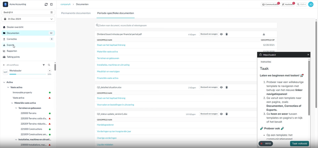
There was also one area of risk we were particularly sensitive to: the new layout might be a genuine improvement, but if it was too challenging for users to rebuild years of muscle memory from the old layout then it might do more harm than good. So our usability tests asked participants to complete some of their most common tasks and journeys, allowing us to see how quickly they adapted. The speed at which they did so gave us the confidence to commit to building the design for real.
Continuous improvement from beta testing through to rollout
The usability testing gave us enough confidence to start building the redesign, but it was not the end of the learning process. Prototypes are useful because they let us test ideas quickly and safely, but they are still simulations. Real work is messier. Users are under time pressure, switching between tasks, working with live client data, and relying on habits built up over months or years.
That is why beta testing was such an important next step. It allowed us to move from controlled research tasks into real usage, with a smaller group of users trying the new navigation in their day-to-day work before we rolled it out more widely. We wanted to understand whether the improvements we had seen in testing still held up when people were using Silverfin for actual compliance work.
We launched rough early versions of our beta implemented and gathered feedback through a mix of direct user comments, support conversations, usage data, and session recordings. This helped us understand not just what people said about the redesign, but how they actually used it. Some feedback validated the direction we’d taken; other feedback helped us refine the details. We were able to iterate quickly, making the design more compact and less cluttered: refining the collapsed version of the navigation panel, changing the hierarchy of certain navigation items, and making hundreds of other small improvements.
“For us, rollout wasn’t just about shipping the new navigation. It was about making sure the change landed well. We listened closely to beta users, watched how the design behaved in real workflows, and used that feedback to make the experience clearer, more refined, and easier to adopt.” – Thomas Worthington, Product Manager
Rollout also needed to be handled carefully. Navigation is not a feature people visit occasionally; it is part of almost every journey through the product. Even positive changes can feel disruptive when they affect something users rely on every day. We therefore treated rollout as another stage of learning, not just a launch plan. We communicated what was changing, monitored feedback closely, and continued to make improvements as more users moved onto the new design.
For our users, navigation is not just a way to move around Silverfin — it shapes how quickly and confidently they can get work done. This redesign was our opportunity to remove friction from those everyday journeys and create a clearer, more consistent experience across the platform. The result is a navigation system built from real user insight, tested in real workflows, and designed to keep improving as our users’ needs continue to evolve.